In the digital age, lead generation is the lifeblood of successful businesses. Converting website visitors into potential customers requires a strategic approach, and one of the key tools in your arsenal is creating effective lead generation forms.
These forms, when crafted thoughtfully, can drive conversions and provide valuable insights about your audience. In this blog post, we’ll delve into the best practices for creating lead-generation forms that maximize results and enhance user experience.
1. Keep it Simple
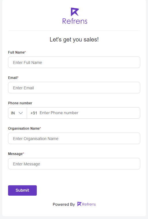
When it comes to lead generation forms, simplicity is your ally. A cluttered and complex form can overwhelm visitors, leading to higher bounce rates. Keep the form concise and ask for only the essential information you need. Generally, asking for a name, email address, and possibly one or two relevant details is enough to initiate contact.
For instance, observe this minimalist form presented by Refrens. It comprises only the essential fields necessary for acquiring the required information. The design allows for ample breathing space, creating a neat and organized appearance.
Also read: The Ultimate List of 39 Best Lead Generation Tools to Supercharge Your Business
2. Craft Compelling Copy
The copy you use in and around your form can greatly influence conversions. Your headline should clearly communicate the value proposition of what visitors will receive in exchange for their information. Use action-oriented language that sparks curiosity and conveys the benefits of signing up. Additionally, include concise and clear instructions on how to fill out the form.
For instance, let’s examine two examples:
Catering to the desires of every book-loving enthusiast, “Amazing Deals on Bestselling E-books” addresses a common pain point. The copy is strategically designed to resonate with readers and entice them with appealing incentives in exchange for their details.

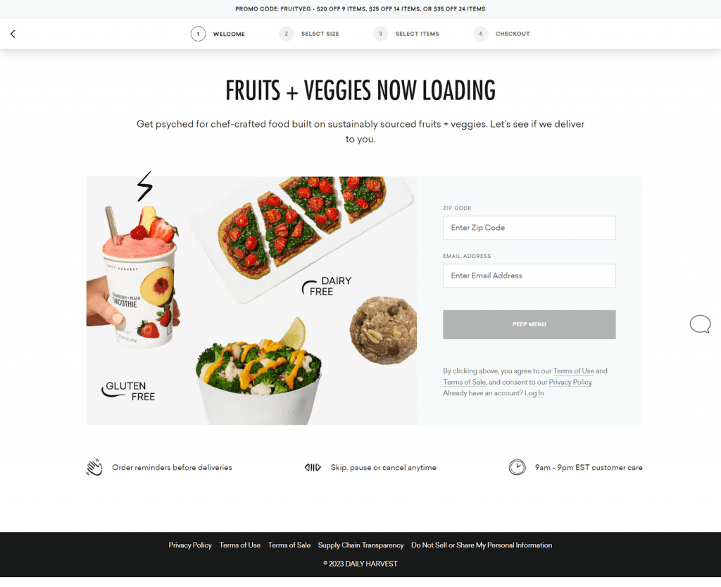
Now, look at Daily Harvest’s vibrant approach. Their peppy and quirky copy instantly lightens the mood, making the process of sharing your email address and zip code feel less daunting and more fun!
Without a doubt, content is the king. Learn how you can leverage content to attract more leads!
3. Minimize Friction
Friction points in your form can lead to abandonment. Minimize the number of steps required to complete the form. If possible, use autofill options to prepopulate fields based on readily available data like the user’s email address. Additionally, reduce the number of optional fields to encourage more submissions.
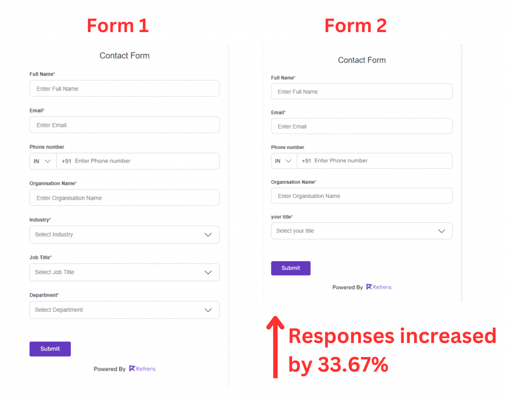
For example, consider this case: By minimizing obstacles within Form 2, this company managed to achieve an impressive 33.67% increase in responses.
4. Offer Incentives
Consider offering a valuable incentive to encourage users to complete your lead generation form. One could offer an incentive in the form of an e-book, whitepaper, webinar, discount, or exclusive content. Make sure the incentive aligns with your target audience’s interests and needs.
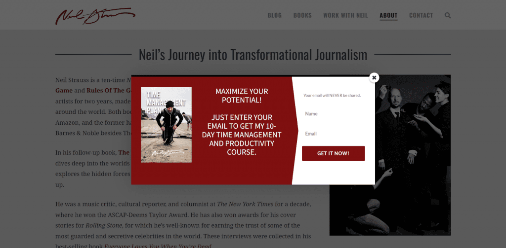
Take a look at this pop-up lead generation form designed by Neil Strauss, a renowned American author. Strauss is offering a valuable freebie—a time management and productivity course—making it particularly appealing to students and working individuals worldwide.
5. Ensure Mobile Responsiveness
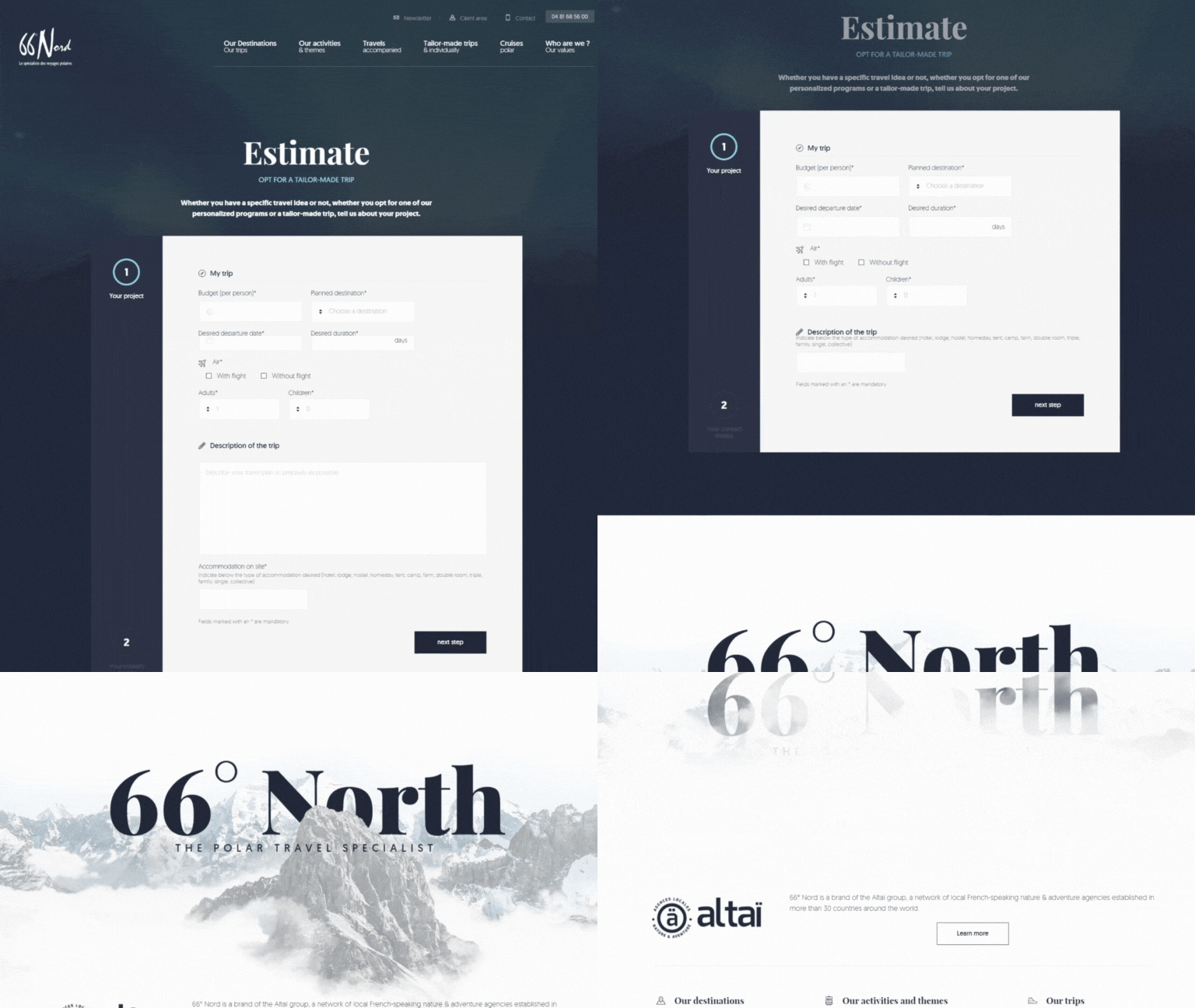
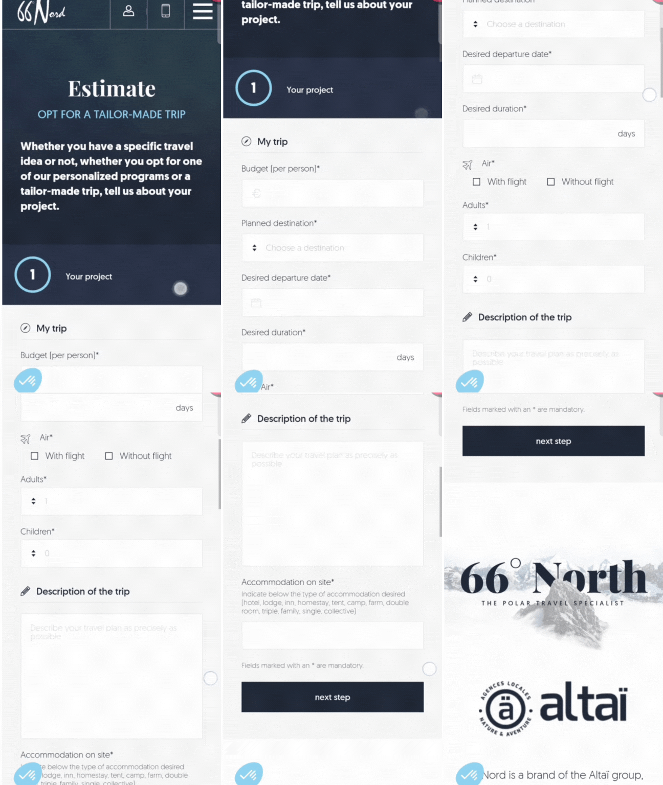
With the increasing use of mobile devices, your lead generation form must be fully responsive. Perform cross device testing across various screen sizes to ensure that it’s easy to navigate and fill out on smartphones and tablets. A cumbersome mobile experience can deter potential leads.
66Nord is one of the good examples of the same.
6. Build Trust and ensure privacy
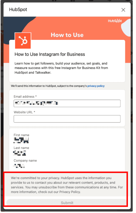
Include a clear privacy policy statement that assures users their data will be handled responsibly. Adding trust badges, security certifications, and customer testimonials can further enhance credibility and alleviate concerns about data security.
For instance, let’s examine this form by HubSpot. It stands out by explicitly outlining how it plans to utilize your information, providing transparent access to the company’s privacy policy.
7. Strategically Position the Form
The placement of your lead generation form on your website is crucial. Consider placing it prominently on high-traffic pages, such as the homepage or a dedicated landing page. The form should be easily noticeable without being obtrusive. Use contrasting colors and whitespace to make it stand out while maintaining the overall aesthetic of your website.
For instance, consider Broadcast2world as an excellent illustration of this practice. They’ve seamlessly integrated a form within a captivating video backdrop, featuring just two essential fields. What’s particularly impressive is the creative call-to-action placed prominently at the top of their landing page.

8. Use Progressive Profiling
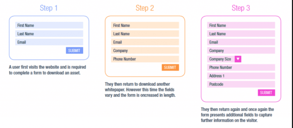
For returning visitors, utilize progressive profiling to gather additional information over time. Instead of bombarding them with the same set of questions, progressively collect more data in subsequent interactions. This approach maintains engagement while gradually building a more detailed profile.
Look at the following picture for easy understanding.
9. Use a Custom Form For Each Purpose
A one-size-fits-all approach rarely yields optimal results in lead generation. To truly engage your audience, customize your forms for each specific campaign. Whether you’re promoting a webinar, launching a product, or offering a free trial, tailor the form fields to align with the campaign’s objectives. This level of personalization can significantly boost conversion rates.
For example, take a look at these Lead Generation forms designed by Neil Patel. Notice how each form boasts a unique design, reflecting its specific purpose and accompanied by distinct copies. What’s even more interesting is that the first image showcases a pop-up form, while the second one is strategically positioned at the end of the page.


Also learn: Creating Effective Lead Capture & Contact Us Forms – A Comprehensive Guide
10. Regularly Test and Optimize
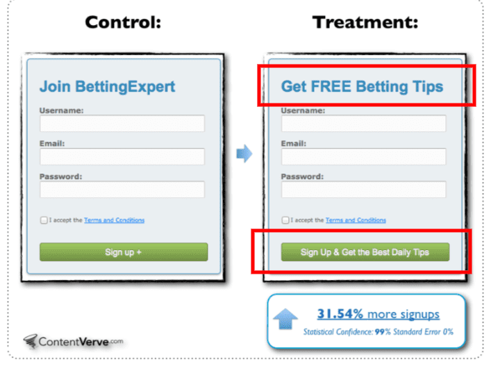
Lead generation forms are not static entities. Regularly monitor their performance through A/B testing. Experiment with different form layouts, wording, and even the number of fields to identify what resonates best with your audience. Use analytics to track conversions, bounce rates, and time spent on the form to inform your optimization efforts.
For example, take a look at bettingexpert.com’s remarkable achievement. Through a simple change in the copy and call-to-action, they managed to boost their leads by a whopping 311.54%.
11. Express Gratitude
After a visitor completes your lead generation form, don’t let the interaction end abruptly. Redirect them to a dedicated “Thank You” page that expresses your appreciation for their interest. This simple gesture not only reinforces a positive user experience but also provides an opportunity to deliver additional value. You can use this page to offer further resources, guide them to relevant content, or even prompt them to share the offer with their networks.
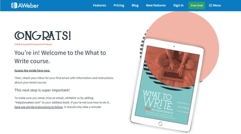
For example, observe this thank-you page that radiates positivity with its uplifting language. Accompanied by a free guide, it instills a sense of pride and confidence in the viewer, strengthening their connection with the company.
Take a moment to review this Thank You page created by AWeber. It offers a warm welcome message and provides clear instructions on what to do next, effectively guiding the viewer toward the next steps in a seamless manner.
Conclusion
In conclusion, lead generation forms are essential tools for driving business growth. By implementing these best practices, you can create forms that not only capture valuable leads but also enhance user experience, foster trust, and contribute to your overall marketing strategy. Remember, the key lies in simplicity, strategic design, and a commitment to continuous improvement.
Also Read: A Comprehensive Guide to Lead Generation
Read more: Top 10 Billing Software For Chartered Accountants
Also Learn: Industry-wise Top Lead Management Software in 2023
